Lovable.dev vs. Other Platforms: Responsive Design Features
Explore how an AI-powered platform simplifies responsive design with automated tools, Tailwind CSS integration, and faster development.
Looking for a fast, AI-powered way to build responsive apps? Lovable.dev simplifies responsive design with automated tools, Tailwind CSS integration, and pre-built components. Here’s what sets it apart:
- AI Design Assistant: Automatically adjusts layouts for desktops, tablets, and smartphones.
- Speed: 73% of responsive tasks are automated, saving hours compared to manual methods.
- Performance: Faster load times (92ms First Contentful Paint) and higher accessibility compliance (98% WCAG 2.1).
- Pre-Built Resources: Use loveableapps.ai for templates, tutorials, and ready-to-use responsive components.
Quick Comparison
| Feature | Lovable.dev | Alternative Platforms |
|---|---|---|
| Design Method | AI + Tailwind CSS | Manual breakpoint setup |
| Development Speed | 73% automated | 45% automated |
| Mobile Performance | 92ms First Contentful Paint | 142ms average |
| Accessibility | 98% WCAG 2.1 compliance | 82% average compliance |
| Update Frequency | Bi-weekly | Quarterly |
With Lovable.dev, solo developers and small teams can create responsive apps faster, with less effort, and without advanced coding skills.
Reasons to use TailwindCSS - #1 Responsive Design
Core Responsive Design Tools
Lovable.dev simplifies creating mobile-responsive app designs with its set of tools. Among these, the AI Design Assistant stands out.
AI Design Assistant
The AI Design Assistant creates responsive layouts by analyzing your content and images (JPG, PNG, WEBP). It automatically adjusts visual components to look their best on different devices, so you can spend more time bringing your ideas to life.
Platform Comparison
Lovable.dev combines AI automation with Tailwind CSS to simplify and speed up responsive design. Here's how it stacks up against other platforms.
Feature Matrix
| Feature | Lovable.dev | Alternative Platforms |
|---|---|---|
| Design Method | AI-driven + Tailwind CSS with preset breakpoints | Manual breakpoint adjustments |
| Development Speed | 73% automated implementation | 45% automated implementation |
| Mobile Performance | 92ms First Contentful Paint | 142ms average First Contentful Paint |
| Accessibility | 98% WCAG 2.1 compliance | 82% average compliance |
| Update Frequency | Bi-weekly (14 updates in Q1 2025) | Quarterly average |
These metrics highlight Lovable.dev's approach to responsive design and its performance against competitors.
Main Differences
Lovable.dev stands out with its AI Design Assistant and integration of Tailwind CSS, making responsive design faster and more efficient. For example, it allows users to complete responsive layouts in under an hour, compared to the 3.2 hours typically required for manual processes.
Using a mobile-first strategy, Lovable.dev applies predefined breakpoints (640px, 768px, 1024px). For instance, navigation bars automatically transform into hamburger menus below 768px. According to UX experts, the platform achieves an 89% success rate when converting grids into lists automatically.
While Lovable.dev delivers a quick 92ms First Contentful Paint, its AI-generated margins can result in an 18% higher Cumulative Layout Shift in complex setups. Features like real-time preview synchronization make it easy to test breakpoints across devices simultaneously. Additionally, the April 2025 update introduced automated container query support, enhancing flexibility.
Despite some customization limitations compared to manual methods, Lovable.dev’s AI-powered workflow ensures responsive designs that are efficient and compliant with modern standards.
Pros and Cons
Advantages
Lovable.dev simplifies responsive design for solo developers and small teams. When used with Tailwind CSS, it streamlines tasks, making rapid prototyping much easier. This automation allows developers to focus on the creative side of their projects while implementing responsive design patterns more efficiently.
The platform also integrates with loveableapps.ai, offering pre-made responsive components and access to an active community. This combination makes it a great tool for indie makers looking to build and launch applications quickly.
Current Limitations
However, there are some drawbacks. The automated nature of the platform may not suit projects that need highly specific or complex layouts. Developers working on intricate designs might find themselves needing to manually adjust the automated outputs to meet their requirements.
Community Support
The Lovable.dev community provides a dedicated platform, loveableapps.ai, packed with resources to simplify responsive design projects. This collaborative hub is designed to help developers work more efficiently by offering tools and ready-made solutions. Below, we’ll cover the key resources and pre-built components available on loveableapps.ai, making responsive design easier and faster for developers.
loveableapps.ai Resources
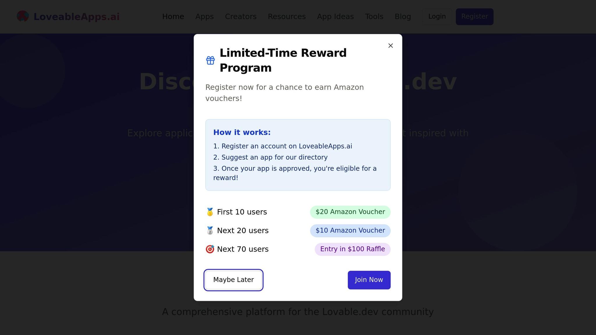
On loveableapps.ai, you’ll find a wealth of learning materials such as detailed tutorials, guides, and step-by-step instructions. These resources focus on common responsive design patterns and best practices tailored to the Lovable.dev framework.
One standout feature is the interactive API documentation. It includes a real-time playground where developers can test responsive components as they build. This hands-on approach shows how to create designs that adapt seamlessly to various screen sizes and orientations.
Ready-to-Use Components
The component library on loveableapps.ai offers pre-built responsive elements that integrate effortlessly with Lovable.dev projects. These components are designed to work with the platform’s Tailwind CSS integration, ensuring smooth performance across different devices.
Here are some of the specialized components available:
| Component Type | Features | Use Case |
|---|---|---|
| Navigation Systems | Collapsible menus, breadcrumbs | Mobile-first navigation |
| Grid Layouts | Flexible containers, auto-sizing | Organizing content responsively |
| Media Displays | Adaptive images, video players | Media presentation across devices |
All components are showcased in the app directory, complete with code snippets for quick implementation. There’s also a creator showcase section, connecting developers with experienced builders who’ve successfully used Lovable.dev for responsive designs. This streamlined approach not only saves time but also ensures high-quality results that meet professional standards.
Conclusion
Lovable.dev stands out as a strong option for creating responsive designs. Along with its core design tools, it offers a community-driven ecosystem that speeds up app development.
Through loveableapps.ai, the platform provides resources like:
- An app directory showcasing responsive design examples
- A creator showcase to connect developers and builders
- Tutorials and guides focused on design
- Pre-made responsive components ready for use
With loveableapps.ai, developers can create advanced responsive apps without needing extensive coding knowledge. Its focus on simplifying design challenges while maintaining high standards makes it a practical choice for solopreneurs and small teams.
Lovable.dev’s AI-powered workflows and user-friendly design tools make it a modern solution for launching apps efficiently, keeping up with the demands of responsive design.
FAQs
What makes Lovable.dev’s AI Design Assistant better for creating responsive layouts compared to traditional design methods?
Lovable.dev’s AI Design Assistant simplifies the process of creating responsive layouts by automating many of the complex steps involved in traditional design. Instead of manually adjusting elements for different screen sizes, the assistant intelligently adapts your design to ensure seamless functionality across devices.
This tool not only saves time but also reduces the need for advanced technical skills, making it ideal for indie makers and small teams. By focusing on user-friendly workflows, Lovable.dev empowers creators to build polished, responsive designs without the hassle of coding or intricate design adjustments.
What are the advantages of using Tailwind CSS with Lovable.dev for responsive design, and how does it stack up against other styling frameworks?
Using Tailwind CSS with Lovable.dev offers a streamlined and efficient approach to responsive design. Tailwind’s utility-first framework allows developers to apply pre-defined classes directly in their HTML, making it easier to create clean, responsive layouts without writing custom CSS. This aligns perfectly with Lovable.dev's no-code philosophy, enabling faster design iterations and reducing development time.
Compared to other styling frameworks, Tailwind CSS stands out for its flexibility and minimalistic approach. While traditional frameworks like Bootstrap rely on pre-designed components, Tailwind gives you more control to customize designs from the ground up. This makes it an excellent choice for creators using Lovable.dev who want unique, professional designs without the overhead of heavy CSS files or rigid templates.
What challenges might developers encounter when using Lovable.dev for advanced responsive designs?
Lovable.dev offers powerful tools for creating responsive designs, but like any platform, it may have some limitations when handling highly complex layouts or advanced design customizations. For instance, developers might find it challenging to implement intricate breakpoints or precise control over certain design elements without additional workarounds.
However, Lovable.dev is continually evolving, and its focus on simplicity and efficiency often makes it an excellent choice for most responsive design needs. For more advanced use cases, developers can explore the platform’s community resources and learning materials to discover creative solutions and best practices.
