How to Customize Themes in Lovable.dev Apps
Learn how to customize themes in your apps for better branding, user engagement, and accessibility using intuitive tools and advanced styling options.
Customizing themes in Lovable.dev apps is a simple way to improve your app's design and branding. Here's how you can do it:
- Why Customize?: Better user engagement, stronger branding, and improved accessibility.
- How to Start: Use the Visual Edit mode in your project dashboard to access theme tools.
- Key Features:
- Adjust colors, fonts, and component styles.
- Preview changes on different devices in real-time.
- Save your edits as drafts, new themes, or updates.
- Advanced Styling: Use Tailwind controls for detailed adjustments like padding, margins, and animations.
- Design Tips: Ensure color contrast for accessibility, use neutral dashboard backgrounds, and test for colorblind users.
With Lovable.dev's tools, you can quickly create professional, user-friendly themes without diving into complex code. Start by exploring pre-made themes or build your own from scratch.
Install and Modify Your App Theme Pt 2: Advanced Styling ...
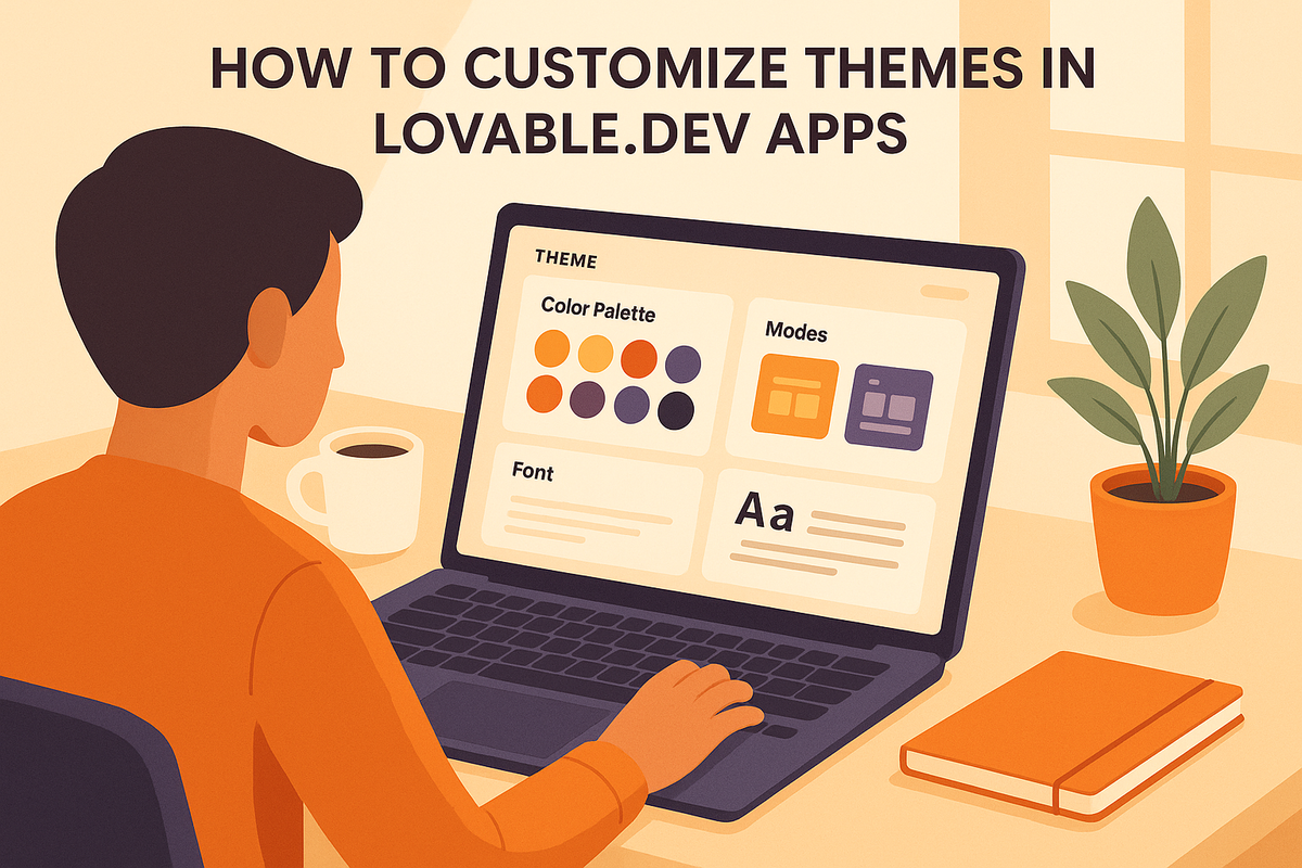
Finding Theme Tools in Lovable.dev
Switch to Visual Edit mode to make real-time adjustments to your theme.
Opening Visual Edit Mode
Head to your project dashboard, click on the "Visual Edit" button, and choose any element to open the styling panel.
Locating Theme Settings
You'll find theme settings in the right-side panel, neatly categorized for easy navigation:
- Global Themes: Browse through pre-built and custom theme collections.
- Color Palette: Customize primary, secondary, and accent colors.
- Typography: Modify fonts and text-related properties.
- Component Styles: Adjust the appearance of specific elements.
The panel uses a clear hierarchy, so you can easily see how your changes will affect your application. Once you've made your adjustments, preview them and apply as needed.
Preview and Save Changes
- Device Previews: Use toggles to check how your theme looks on different screen sizes.
- Track Edits: The "Changes" tab keeps a log of all modifications made during the session.
- Save Options: Choose between Save Draft, Save New Theme, or Update Theme.
For added convenience, try the split-screen preview mode to view your updates as you make them. Plus, the auto-save feature periodically backs up your work, which you can access anytime through the version history menu.
Theme Customization Steps
Customizing themes in Lovable.dev is simple with its built-in visual tools. Here's a breakdown of how to craft your ideal theme.
Select or Create Themes
Begin by establishing the visual identity for your app. Open the Theme Library in Visual Edit mode to browse pre-designed themes. These themes come with pre-set color schemes and typography options.
Want to create your own theme? Here's how:
- Click "Create New Theme" in the Theme Library.
- Give your theme a name (e.g., "Brand Theme 2025").
- Pick a base preset to start from, or go with "Blank Canvas" for a fresh start.
- Save your new theme to begin customizing it.
Adjust Colors and Text
Once your theme is selected or created, fine-tune its design using the style panel:
Color Settings:
- Use the color picker or input a hex code to set your primary color.
- Define complementary secondary and accent colors.
- Customize background colors for different sections.
- Configure hover and active states for interactive elements.
Typography Settings:
- Choose fonts from the built-in library.
- Adjust font sizes for headings and body text.
- Tweak line height and letter spacing.
- Set text colors for various states, like default, hover, or disabled.
For more detailed adjustments, move on to the advanced Tailwind controls.
Tailwind Controls for Advanced Styling
Need more precision? Lovable.dev includes Tailwind's powerful styling tools. Access these through the Advanced Styling tab for detailed control.
Layout Options:
- Adjust padding and margins with preset values.
- Set responsive breakpoints for different devices.
- Configure flex properties to manage element positioning.
Component Styling Options:
- Customize border radius and shadows.
- Set transition animations for smoother effects.
- Adjust opacity and blur for specific elements.
Theme Design Guidelines
Create themes that are easy to use and visually appealing. Use these tips to ensure your designs are clear and accessible to everyone.
Color Accessibility
Make your app user-friendly by considering these points:
Contrast Standards:
- Ensure at least a 4.5:1 contrast ratio for regular text.
- For large text (18pt or more) and graphical elements, aim for a 3:1 ratio.
- Use accessibility tools to check contrast ratios.
Supporting Color Blind Users:
- Don’t rely on color alone - add patterns, icons, or text labels to differentiate elements.
- Test your theme with colorblind simulation tools to ensure usability.
Dashboard Color Selection
Use thoughtful color choices to make dashboards easy to read and reduce visual fatigue. Follow these tips:
Background Colors:
- Stick to neutral tones like soft whites or grays for sections with lots of data.
- Add subtle shading to separate different dashboard areas.
- Keep backgrounds for charts and graphs light to improve readability.
Colors for Charts and Graphs:
- Use distinct colors for each data series.
- Limit your color palette to 6–8 shades for clarity.
- Stick to consistent color coding across metrics.
- Use bright colors sparingly to highlight critical details.
Here’s an example color scheme for guidance:
| Element Type | Example Color | Usage Context |
|---|---|---|
| Primary Data | #2563EB (Blue) | Key metrics, main KPIs |
| Secondary Data | #059669 (Green) | Supporting metrics |
| Alerts | #DC2626 (Red) | Critical notifications |
| Background | #F8FAFC (Light Gray) | Dashboard base |
| Text | #1E293B (Dark Blue) | Labels and values |
For more ideas, check out Lovable.dev's community resources on theme design.
LoveableApps.ai Resources
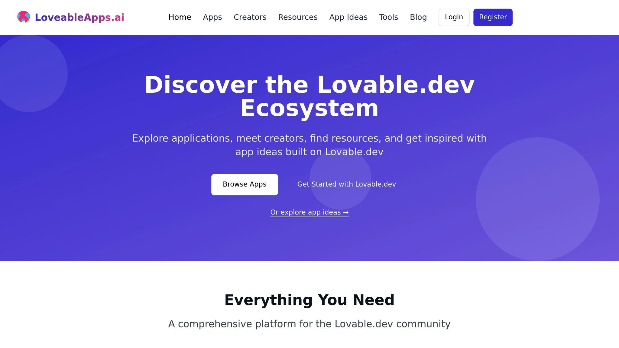
Once you've customized your theme, take your design approach further by exploring the community insights and expert guides available on LoveableApps.ai. These tools can spark ideas and offer practical design tips.
Community Theme Examples
The "From the Community" section on LoveableApps.ai highlights real-world custom theme examples. By checking out these featured apps, you can:
- Explore unique color combinations and styling techniques
- Examine industry-specific design approaches
- Gain ideas from user-friendly and visually appealing color schemes
- Learn how Tailwind controls are applied in creative ways
Use the directory filters to narrow down examples that align with your specific industry or design needs.
Theme Design Guides
LoveableApps.ai also offers a variety of resources to help you master design principles. These guides cover essential topics like:
- Choosing and applying effective color palettes
- Pairing and selecting typography
- Styling components and ensuring responsive design
These resources are regularly updated by the Lovable.dev community, providing ongoing inspiration to help you refine and improve your app's theme.
Conclusion
Customizing themes in Lovable.dev apps is simple and helps maintain consistent branding. With the platform's visual editing tools and Tailwind controls, you can easily adjust colors, typography, and other styling elements to fit your needs.
As you work through the steps, pay attention to key design principles like color contrast, responsive design, and compatibility across devices. These details ensure your themes are functional and user-friendly.
For extra support, LoveableApps.ai offers resources like community examples and design guides. These tools provide practical tips and ideas to improve your design process.
FAQs
How can I make sure my custom theme in Lovable.dev is accessible for users with colorblindness?
To ensure that your custom theme in Lovable.dev is accessible for users with colorblindness, focus on creating strong color contrasts and avoid relying solely on color to convey information. Use tools like color contrast checkers to verify that text and background combinations meet accessibility standards (e.g., WCAG guidelines). Additionally, consider incorporating patterns, labels, or icons alongside colors to make your design more inclusive.
By prioritizing accessibility, you can create a more user-friendly experience for everyone while staying true to the Lovable.dev ethos of building inclusive apps.
What are the advantages of using Tailwind controls for advanced styling in Lovable.dev themes, and how do they compare to basic theme customization options?
Using Tailwind controls in Lovable.dev themes allows for more precise and flexible styling compared to basic customization options. With Tailwind, you can directly apply utility-first classes to fine-tune layouts, colors, spacing, and other design elements, offering greater control over the app's appearance. This is especially useful for developers looking to create unique, professional-grade designs without writing extensive custom CSS.
In contrast, basic theme customization focuses on pre-defined settings such as color palettes, font choices, or layout presets. While these options are user-friendly and quick to implement, they may feel limiting for advanced users who want deeper design control. Tailwind controls bridge this gap, providing a powerful toolset for those who want to elevate their app's visuals within the Lovable.dev ecosystem.
How can I create a brand-new theme in Lovable.dev without using a pre-made template?
Currently, there isn’t a detailed guide available on creating a completely new theme from scratch in Lovable.dev. However, you can start by exploring the theme customization features within the platform, which allow you to modify colors, fonts, and layouts to suit your preferences. For advanced customization, consider reaching out to the Lovable.dev community for tips or resources that might help you build your unique theme.