Cross-Platform Data Visualization with Lovable.dev
Create stunning cross-platform data visualizations effortlessly with an AI tool that handles everything from design to deployment.
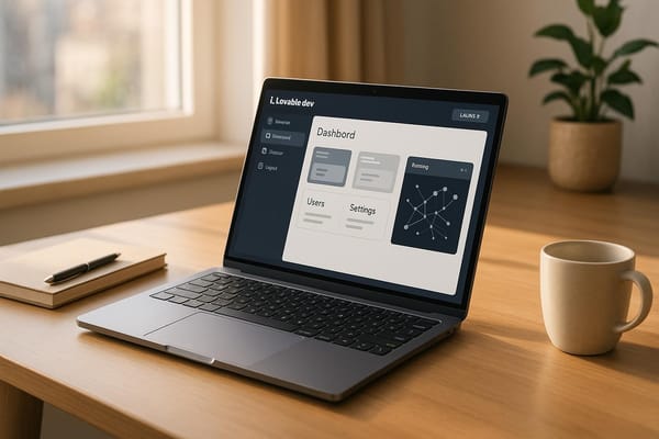
Want to create data visualizations for multiple platforms without writing code? Lovable.dev makes it simple. This AI-powered tool lets you describe your app idea in plain language, and it builds everything for you - charts, dashboards, and even responsive designs for web, iOS, Android, and more. Here’s what you can do with it:
- Set up projects easily: Just outline your needs, and Lovable.dev handles design, navigation, and dependencies like Chart.js.
- Connect data sources: Plug in APIs, databases like Supabase, or even CSV files for real-time updates.
- Create visualizations: Request bar charts, line graphs, or interactive dashboards, and the AI generates them instantly.
- Customize effortlessly: Adjust colors, fonts, and layouts by describing your preferences - no coding required.
- Deploy with one click: Skip the hassle of hosting; Lovable.dev takes care of it.
Whether you’re building a sales dashboard or a detailed analytics tool, Lovable.dev simplifies the process, saving time and effort. Let’s dive into how it works.
Setting Up Your Lovable.dev Project
Creating and Configuring Your Project
Getting started with Lovable.dev is straightforward, thanks to its AI-driven setup that takes care of the technical heavy lifting. When you create a new project, the platform automatically sets up a responsive design that works smoothly across web browsers, mobile devices, and tablets. This means you can focus on describing your visualization needs in plain language without worrying about compatibility issues.
To kick things off, outline the features you want for your project. For example, if you're working on a data visualization project, specify the types of charts, graphs, or dashboards you'll need. Lovable.dev's AI then translates this information into navigation, routing, and a basic page structure. You'll need to create a lovable.json file in your project root to manage dependencies. For instance, if you're using Chart.js, your lovable.json file might look like this:
{
  "dependencies": {
    "chart.js": "latest"
  }
}
This setup ensures that Lovable.dev fetches the latest version of Chart.js automatically, so you can start building professional-grade charts without needing to configure everything manually in a terminal.
The platform also connects your project to a database for real-time data persistence, ensuring your visualizations remain consistent across devices. A user from Veloxforce shared their experience:
"Lovable empowers me to create frontends that surpass my own technical limitations. It allows me to swiftly develop prototypes to showcase to clients, without the need for generic templates or starting from scratch. Essentially, it enables me to concentrate on the backend while GPT Engineer efficiently generates a functional and visually appealing frontend my clients will love."
To get the best results, take some time to refine your project descriptions. The clearer and more specific you are, the better the AI builder will understand your needs. Once your project is configured and the basic dependencies are in place, the next step is to connect the data sources that will power your visualizations.
Connecting to Data Sources
Lovable.dev makes it easy to connect to a variety of data sources, whether you're using APIs, databases, CSV files, or other external options. The platform offers direct integrations with GitHub and Supabase, as well as verified connections to services like Stripe, OpenAI, D3.js, and Highcharts.
For projects based in the US, make sure to format dates as MM/DD/YYYY, use $ for currency, and apply commas for thousands and periods for decimals. These localization details help ensure your visualizations meet user expectations.
One standout feature is the Supabase integration, which allows you to manage both the front-end and back-end operations through a single chat interface. Supabase includes PostgreSQL capabilities, user authentication, file storage, real-time updates, and edge functions. This means your visualizations can display live data and provide a seamless user experience.
If you're working with external APIs that aren't natively supported, it's important to provide clear documentation, such as OpenAPI specs or example data formats. This helps Lovable.dev process your data accurately. For secure API access, you can use Supabase Edge Functions as a proxy or integrate the API directly. This approach protects sensitive credentials while ensuring your visualizations can access the data they need.
These integration features are a cornerstone of Lovable.dev, enabling indie creators and small teams to build dynamic visualizations quickly. By combining powerful database and API integrations, the platform can generate custom dashboards tailored to your specific needs. Just define the metrics and visualization types you want, and Lovable.dev will handle the rest, connecting everything seamlessly to your chosen data sources.
Building and Customizing Visualizations
Adding Visualization Components
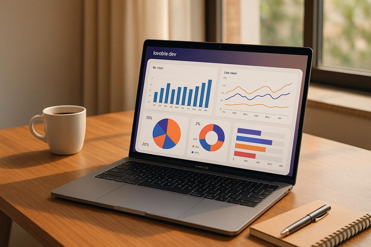
Once your data sources are connected, creating visualizations in Lovable.dev is a smooth process. Thanks to its AI-driven design, you can simply describe what you need in plain language, and the platform takes care of generating charts, dashboards, or interactive elements.
To get started, define the metrics you want to visualize. For example, you could say, "Build a sales dashboard showing monthly revenue trends, top-performing products, and regional performance comparisons." The AI instantly transforms your request into a fully functional, custom dashboard.
Gone are the days of writing lengthy code for each chart type. Lovable.dev automatically generates visualizations - like bar charts, line graphs, or pie charts - and includes responsive, interactive filters to make them more dynamic.
For more advanced visualizations, you can integrate Chart.js by adding it to your lovable.json dependency list. This unlocks powerful charting features while maintaining the platform's user-friendly interface. The system ensures that all components display correctly across devices, whether it's a desktop, tablet, or smartphone, with no additional setup required.
Interactive features are another highlight. You can request options like drill-down capabilities, hover tooltips, and dynamic filters. The platform ensures these interactions work seamlessly, whether users are clicking with a mouse or tapping on a touchscreen. Once your charts are set up, you can fine-tune their appearance to align with your brand.
Customizing Visuals for Impact
Lovable.dev is designed to produce polished dashboards that follow modern UI and UX standards. While the default visuals look great, you have plenty of ways to tailor them to meet your specific needs and branding.
Adjustments like color themes, spacing, headings, and chart types are as simple as describing your preferences. For instance, you might say, "Switch to a blue and green color scheme, increase font sizes for better readability, and bold the chart titles." The AI applies these changes consistently across your dashboard, ensuring a cohesive look while adhering to Lovable.dev’s cross-platform design principles.
For applications in the US, you can format dates as MM/DD/YYYY, use dollar signs ($) for currency, and include commas for thousand separators to meet local conventions.
Accessibility is built into the customization process. You can request features like colorblind-friendly palettes, high-contrast modes, or larger text, and the platform incorporates these changes without sacrificing visual quality.
One standout feature is the ability to make precise edits directly. You can click on any chart, label, or component and describe the tweaks you want. This hands-on editing approach lets you refine your visualizations without needing to write a single line of code.
Lovable.dev also ensures your dashboards look professional across all devices. Whether viewed on a large desktop monitor or a small smartphone screen, the platform automatically manages responsive design during customization.
Using AI for Advanced Features
Once your visualizations are customized, Lovable.dev's AI can take things further by adding advanced functionality like real-time updates, predictive analytics, and interactive filtering - all through simple, conversational instructions.
For real-time updates, you can say, "Refresh the dashboard every 30 seconds with new data from the API." The platform handles all the technical details, including state management and efficient data retrieval, so you don’t have to.
Predictive analytics is another area where Lovable.dev shines. You can request features like trend forecasting, anomaly detection, or statistical analysis - even without deep knowledge of data science. The AI integrates these capabilities into your visualizations, allowing you to display future projections alongside current data.
Daniel, a user of Lovable.dev, shared his experience:
"I tried Lovable yesterday, and it was amazing. I had to build a showcase for our own AI model. One prompt was enough to get a solid UI, and after a few iterations it was connected to our API."
Dynamic filtering and interaction systems are equally easy to implement. You can ask for multi-level filters, cross-chart interactions, or conditional formatting based on user actions. For example, clicking a specific region on a map can instantly update other charts to reflect data for that area.
Advanced features like drill-down functionality and multi-dimensional analysis are also straightforward. You can create hierarchical visualizations that start with a high-level summary and let users dig deeper into detailed data. The AI takes care of the complex logic and state management needed for these sophisticated interactions, making it simple for you to deliver a polished, interactive experience.
Testing and Refining Your App
Checking Cross-Platform Consistency
Testing your data visualization app on multiple devices and browsers is key to delivering a smooth user experience. Tools like Lovable.dev's toggle feature make this process easier by allowing you to instantly preview how your charts and dashboards appear on smartphones, tablets, and desktops - all without needing to deploy across various environments.
Make it a habit to test both mobile and desktop views during development. Focus on how well your charts scale, whether text remains legible, and if interactive elements like buttons and filters are easy to use on touchscreens. Also, ensure that labels, legends, and tooltips display properly across different screen sizes.
Don't forget browser compatibility. Test your app on popular browsers like Chrome, Safari, Firefox, and Edge to confirm that your charts render consistently, even when using advanced features like animations or complex interactions.
For US-specific use, double-check that formats such as dates, currency, and measurements display correctly.
If you spot inconsistencies, Lovable.dev's Visual Edit tool can be a lifesaver. It allows you to tweak UI elements directly, ensuring uniform updates across platforms. Once you've verified cross-platform visuals, you can shift your focus to refining your app's design and interactions.
Improving Design and Functionality
Refining your app is an ongoing process, and Lovable.dev's chat interface can streamline this effort. Providing clear and specific instructions will help the AI make precise adjustments. For instance, instead of a vague request like "improve the chart", try something more specific, such as: "Increase the font size of the y-axis labels to 14px and apply a blue gradient color scheme for better readability on mobile."
To maintain consistency throughout your app, use the Knowledge File feature. This acts as a centralized hub for your design guidelines, color palettes, and functional requirements, ensuring every update aligns with your overall vision. You can also pin stable versions of your app, allowing you to experiment with bold changes without risking your progress.
As you refine the app, test interactions like clicking, hovering, and filtering. Use user feedback to improve labels, navigation, and overall usability.
With a polished design in place, focus on selecting the most effective visualization types to convey your data.
Comparing Visualization Types for US Use Cases
Choosing the right visualization style is essential for communicating data effectively, especially for US audiences. Here’s a quick guide:
- Bar charts: Ideal for comparing categories.
- Line charts: Perfect for showing trends over time.
- Pie charts: Great for illustrating proportions or percentages.
- Heat maps: Useful for analyzing large datasets or highlighting geographic patterns.
The key is to match your chart type to the story your data tells and the expectations of your audience. For example, bar charts might work well for quarterly sales comparisons, while heat maps can highlight regional differences in data. By tailoring your visualizations to the needs of American business contexts, you ensure your insights are both clear and impactful.
Deploying Your Visualization App
One-Click Deployment
Once your visualization app is polished and ready, getting it live is a breeze with Lovable.dev's one-click deployment feature. You can skip the hassle of managing servers or dealing with complicated hosting setups, making the process quick and stress-free.
"Instant & intuitive... One-click deploy when ready." - Lovable.dev
To ensure everything runs smoothly, take advantage of Lovable.dev's AI-powered bug-fixing tools. They help identify and resolve issues before deployment, giving you a seamless production experience.
Conclusion
Creating cross-platform data visualization tools with Lovable.dev transforms what used to be a challenging process into something refreshingly simple. Thanks to its AI-powered design, you can focus on defining what you want to achieve, without getting tangled up in the technical intricacies of how to make it happen.
This approach promotes a natural, step-by-step development process. For data visualization projects, starting small and building incrementally works wonders. You can begin with a straightforward prompt outlining your basic dashboard needs, then layer in complexity through additional prompts as your project evolves. This way, you stay in control without overwhelming yourself - or the AI.
We’ve explored the essential steps: setting up your project, linking data sources, customizing visualizations, and deploying with just one click. These features show how Lovable.dev eliminates traditional roadblocks in app development, empowering you to create advanced dashboards by simply describing your goals and refining them as you go. Feedback from users consistently highlights how the platform enables creators to push past technical limits, quickly prototype ideas, and avoid the hassle of generic templates or starting from scratch.
For those eager to grow their skills or connect with others, loveableapps.ai offers a treasure trove of resources. You’ll find tutorials, prompt engineering tips, and a showcase of successful applications built on the platform. The community is a great place to find inspiration and practical advice, whether you’re tackling simple charts or building intricate, multi-platform visualization tools.
Whether you’re an indie creator working on your first data dashboard or a small team developing enterprise-level tools, Lovable.dev’s blend of AI assistance, cross-platform functionality, and easy deployment makes professional-quality results well within reach - even if coding isn’t your strong suit. With Lovable.dev, turning your ideas into interactive visualizations is not only achievable but also genuinely rewarding.
FAQs
How does Lovable.dev protect my data when connecting to APIs and databases?
Lovable.dev takes data security seriously by partnering with reliable platforms like Supabase, which employs Row Level Security (RLS) to manage access at a granular level. This approach ensures that only authorized users can interact with specific data.
Additionally, Lovable.dev promotes essential security practices, such as the secure storage of API keys, to guard against unauthorized access. These steps work together to keep your data protected while allowing smooth integration with a variety of data sources.
Can I use Lovable.dev to create visualizations for unique or specialized data formats? How do I integrate them?
Lovable.dev simplifies the process of working with unique or specialized data formats by offering support for custom integrations through APIs and backends. Whether you're pulling data from external APIs or databases like Supabase, the platform makes it easy to fetch, manage, and display your data.
Getting started is straightforward: configure your API or database connection within your Lovable.dev project. From there, use the platform’s tools to create visualizations that are perfectly suited to your data. This approach ensures your app can handle even the most specific data formats with ease.
How can I write project descriptions that help Lovable.dev's AI create accurate and effective visualizations?
To get the best visualizations from Lovable.dev's AI, make sure your project descriptions are clear and detailed. Mention your data sources, the key metrics you're focusing on, and the type of visualization you’d like to see. Use simple, natural language prompts that are easy to follow. If you have any relevant screenshots, attaching them can provide helpful context for the AI.
For even better outcomes, try meta prompting - break complex instructions into smaller, more specific steps. Lovable.dev's AI performs at its best when you give it concise yet thorough information. Skip the jargon and focus on clarity to help the AI create visualizations that meet your needs perfectly.